Berlin
Portfolio/Service
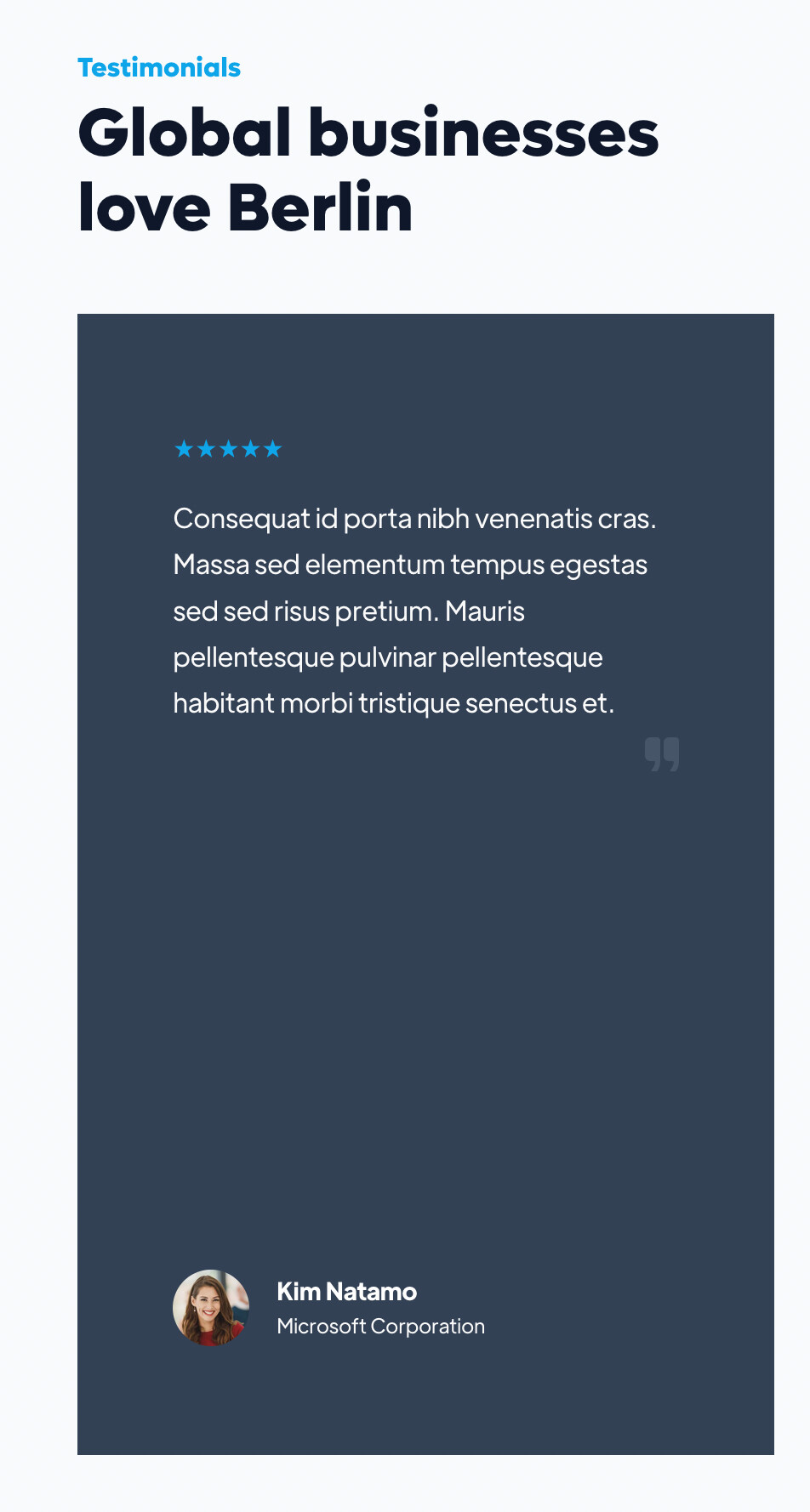
A stylish, clean layout perfect for any modern portfolio — Live demo
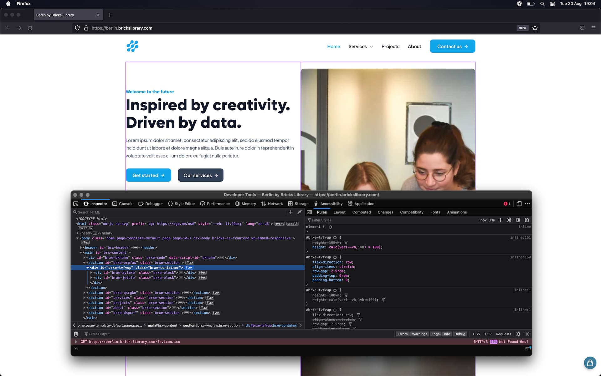
What makes you say that? We did test in Firefox (Safari, Chrome, Opera).
Hi Simon, what device is this? Because we tested live with an iPhone 11, Samsung Note 8, iPad, MacBook, and Large PC monitor and we didn’t see this.
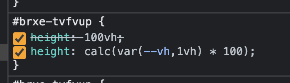
It’s not a browser issue, it’s the vh being used on the containers, likewise the testimonial slider is set with vh also, so stretches a lot on larger screens.
@wplit Ok but the behavior is different on Chrome and Firefox on a same monitor. It loads fine on Chrome even on a larger screen.
Cheers @wplit. This CSS is not being used on those containers though.
I think it’s because the blocks/wrappers are set to 65vh for laptops and above, which we kind of like. This is why I’m asking which device is being used because as soon as they hit tablet they’re set to auto.
This CSS is not being used on those containers though
Possibly a caching issue then? If we’re all seeing different.
I’m seeing that same CSS on the top container in Firefox (on macbook), and Chrome.
Not sure how because the code used is compatible with all browsers. I’ve just checked on PC and laptop, Chrome and Firefox, and mine works fine.
Ok, I see this! But not what the others are stating, we’ll get right on this now.
iMac 24" M1, using Firefox 104.0
Seems to be stuck in our index.css and were unable to remove it, even clearing caches. Is this compiled when using Bricks’ ‘External files’ CSS loading method, we tested and reverted this weeks ago, yet seems to be stuck? Very odd, is this a bug with the performance function? Has anyone had the same issue?
Sorry for late replay. It works now. I was using Firefox Dev.
