I would make cards completely clickable.
Really really well done. I would adjust the alignment of the social media icons on the navigation so they line up with the page width (looks perfect on the mobile view though). Nice job on this!
Hey man, thanks for the feedback. Do you mean I shouldn’t use icons or the fact that some of the icons are thick and some with thin lines, etc. Can you please clarify, Thanks
Yeah, I just saw it. Thanks for the feedback
I mean, you did used lots of icons (it is not problem) with very very different styles.
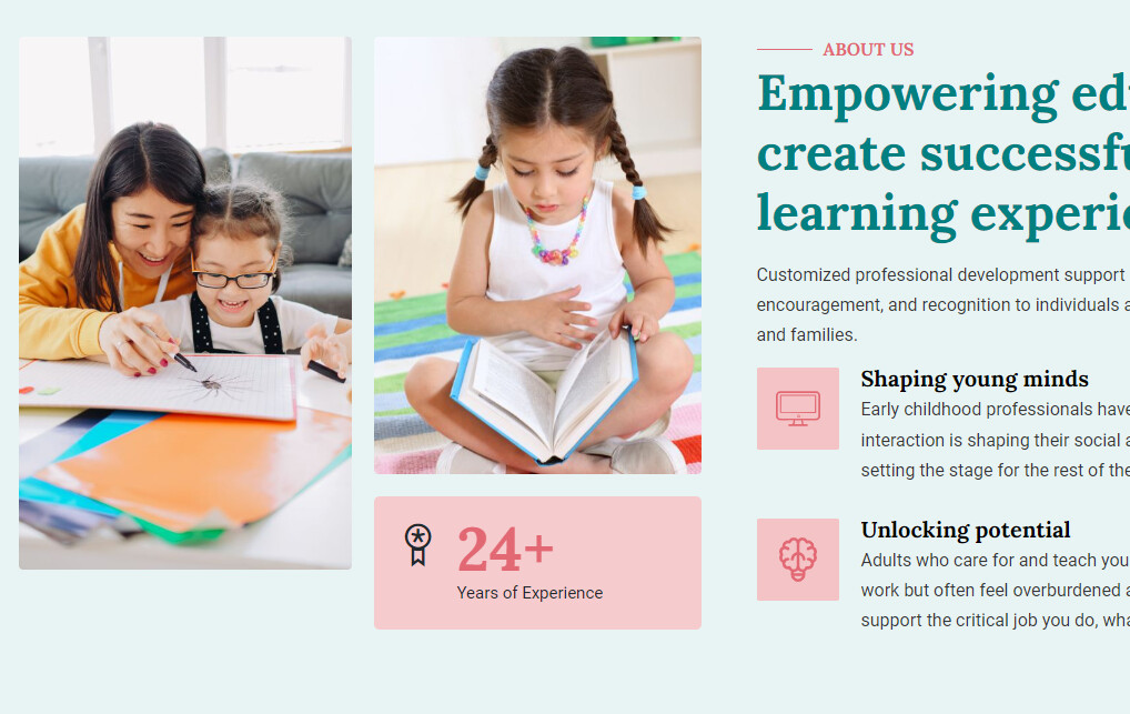
Here, in this section used 3 very different styles icons.
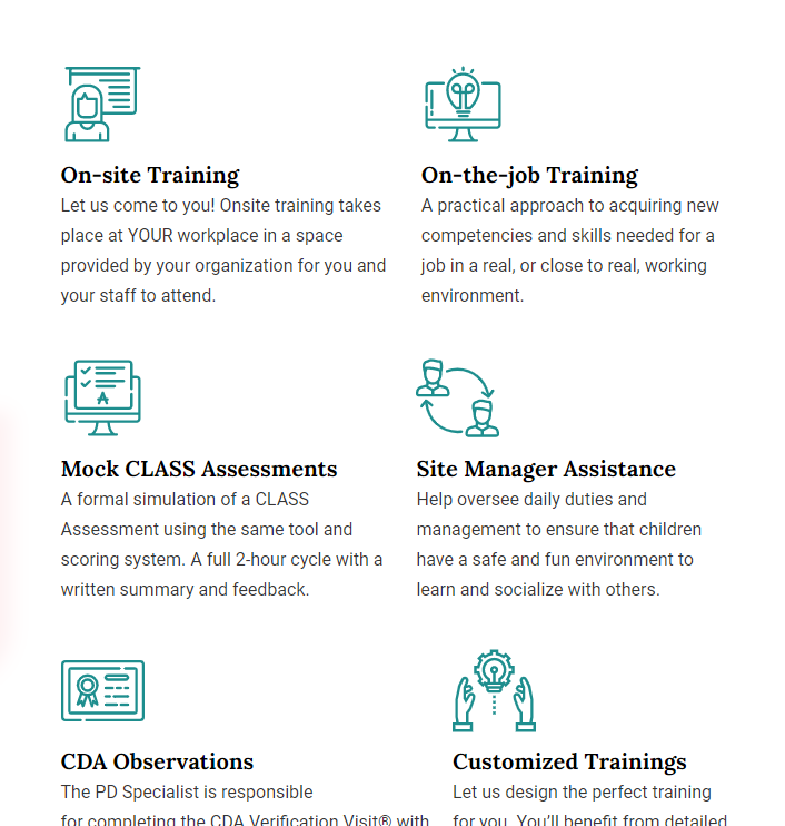
In this section used good concept, all of icons same styles:
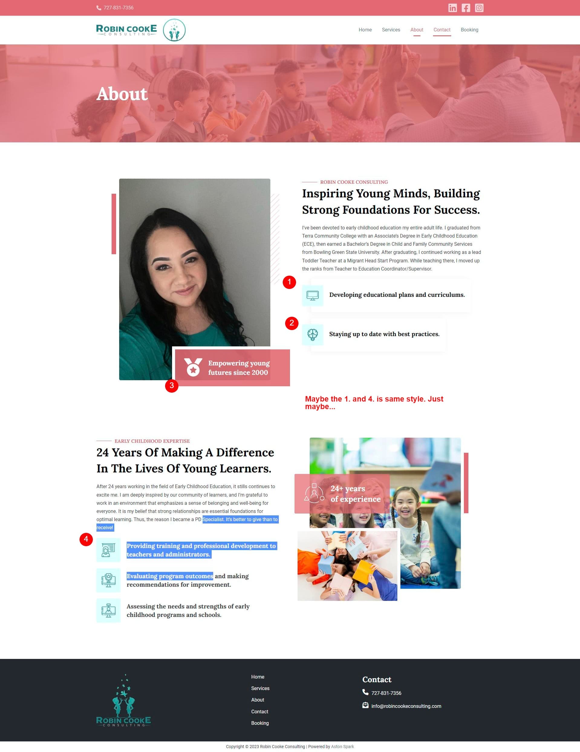
And if you see the full page (example frontpage) you can see, you used !!!FIVE!!! different styles icons. (just an example, what do i mean in different styles: one of from fontawesome, one of thin line, one of bold or filled ect.)
First I want to say nice website.
I was visiting a few sites, because I got a problem with one of mine. Page too wide or in other words the stupid horizontal scroll.
This is on Firefox Android and i hink it is the browser, but then most sites don’t have this problem. Google has also this problem.
Ok I see, what you mean. Got it. Thank you for that feedback. I’ll keep that in mind. Thanks again